Lessons from SXSWi, applied
- 3 minutes read - 626 wordsTwo of my favorite seminars from SXSWi centered around typography, and specifically typography concepts applied to web design.
The first course was entitled “Grids are Good and Why you should use them” delivered by Subtraction.com’s owner Khoi Vinh and Mark Boulton. The second was entitled “Web Typography Sucks” delivered by Mark Boulton and Richard Rutter.
I highly recommend that you take advantage of the presentations that they’ve put online of these. These visual aids are great and really got me thinking about how grids could help me design better web page layouts.
I’ve not yet managed to integrate their lessons into my own theme yet ) or, if I have, I have done so unconsciously ), buuuuut think that I may try to put together a grid-based theme at some point in the future ( although I’m exceedingly loth to deal with PHP hell again any time soon ).
I’ve actually been quite inspired since I took the class and have acquired several key books on the topic:
- Josef Muller-Brockman’s: Grid Systems in Graphic Design
- Meggs’ History of Graphic Design
- Making and Breaking the Grid by Timothy Samara
- Bringhurst’s The Elements of Typographic Style
Between these few tools, I really found my vocabulary embiggened in terms of graphic design. Much like the dreaded “blub paradox” - you don’t know that there’s a richer, more scientific, and more structured way of looking at layout and even paper itself until someone teaches you that there’s a vocabulary out there, of which you are largely ignorant, that explains something you take for granted, and which you are frequently thankful and rely upon.
Another SXSW speaker, the pre-stalker-meltdown Kathy Sierra described this as having “a higher-res experience”. She described that having worked a mixing board, she can’t go to a concert without noting when the mix is just a little bit off.
“Oh gee, just a little bit more base in the snare….”
I suppose it’s similar to the frustration I experience watching others play video games I love. I’m horrible to do this with.
“What, of course the big pile of toilet paper is what you need to roll into your Katamari next! No go in reverse about 20 revolutions, hang a….dammit why are you rolling up those rinky-dink spiders, that’s bull… ( sorry, Mom )”
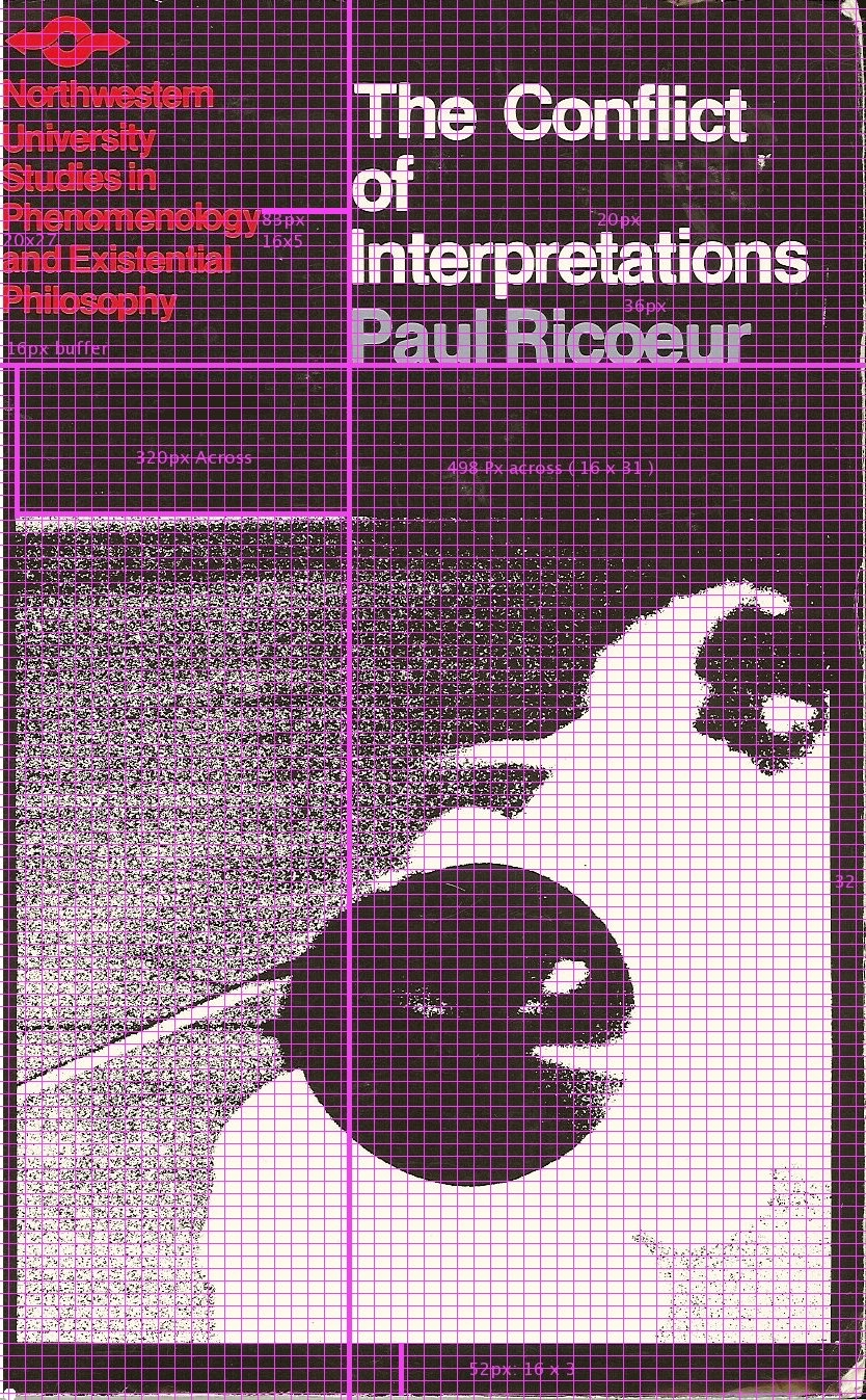
Infused with a new-found love for grids and an understanding of their hidden, subtle, yet powerful ordering presence ( it’s like pyarimadine sugars that way ), I thought of one of my favorite philosophy book covers. The cover from Ricœur’s The Conflict of Interpretations by Northwestern press.
I took a scan of the page and then proceeded to add a grid to it to try to understand the layout and positioning used. To me it’s very European, very clean, very modern, and the presence of that much Helvetica adds to the sense of rationality.
Take a look at the gridded scan as I describe features.
The unit of measure seems to be squares of 16 pixels. From these pixels larger blocks are fabricated. The vertical space between the text and title area to the picture is 320pixels = 16×2×10. The space between the “y” in Phenomenology is 88 pixels to the left edge of the “I” in Interpretations. 88 is 16×5.
This is very interesting to me. As i started to look for more spaces I came to see the number 16’s central importance to this layout.
I don’t think I would have noticed, or cared that someone noticed and cared so much to lay things out as painstakingly as this. What I can say is that I’m hugely glad that those typographers at SXSWi gave this design amateur a chance to have a richer appreciation of their craft, art, and verily, science.