Nostalgia for Aqua
- 4 minutes read - 844 wordsIn 2001, my first Mac, the iMac, embodied computing as furniture. Its translucent white half-dome base housed a DVD drive that melded seamlessly into the surface, like some protean sci-fi spaceship.
From the dome’s apex rose a silver articulating arm suspending the screen - substantial enough to grab and adjust. You could pivot it down during afternoon slumps or angle it to show a friend iTunes visualizations. Light enough to carry, it could migrate to the living room to DJ parties. Encountered in le boudoir, it suggested taste, restraint, and an acceptable level of geekery in a way that wouldn’t make a guest think about doing a 180. Add on a slim, clicky keyboard; a one-button mouse; and surprisingly punchy spherical speakers and you had a computer that could be, as CEO Steve Jobs vision-cast, the hub of your digital life.
Heck, I started this blog on that machine.
This was computing’s last public era, before it retreated into the private universes of our misnamed “phones.” While this openness lived in the hardware’s noteworthy physical design, it was equally present in OSX’s Aqua interface. Recently, I’ve noticed a lot of nostalgia for Aqua’s aesthetics. I think these various nostalgia projects:
- a bag
- historical research
- a recreation of the Aqua UI as open source project
suggest a lament in our hearts:
Computers (phones) today make my heart sad. I want to remember computing when it didn’t make my heart sad. I want to see computers like that again.
Aqua
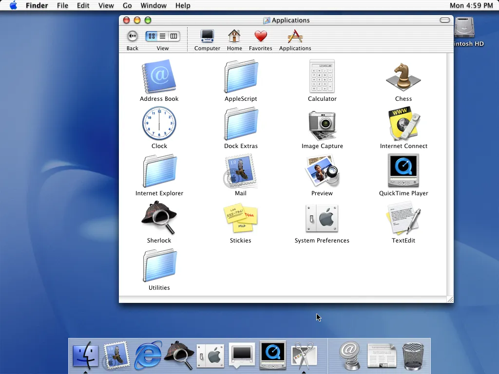
Aqua was a user interface visual language for OSX. It looked like this:

Big, ridiculously friendly, made of Jolly Ranchers. I can still smell that computer’s box and styrofoam packing when I see this picture.
It was famously, and ickily, described by Steve Jobs as being “lickable.”
Nick Babich at “UX Planet” does a superior job breaking down small details that total up to the Aqua experience but let me, in my less-informed way call out a few key elements:
- Jewel-like red/yellow/green window close/minimize/maximize controls
- Light striping on title bars and button regions
- Staggeringly literal icons: chess has a knight piece; email has a stamp; stickies were like literal Post-It Notes ™
- Big, bold slider bars with subtle barbershop pole spiraling that screams “grab me.”
- Jelly-like buttons recalled the tactile feedback of bank-table calculators
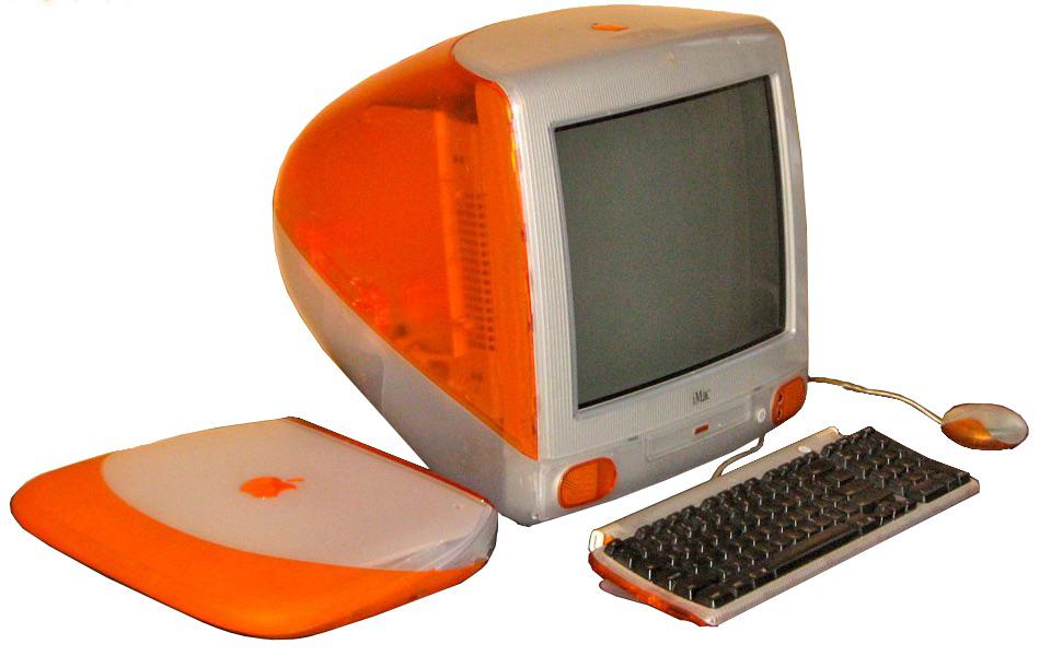
The hardware of this time matched Aqua. The product line favored colors and translucent elements that would be mirrored in Aqua’s code. Here we see the laptop (iBook) and the consumer computer (iMac):

iMac and iBook (laptop)
Translucent jelly casing, bright colors. It’s clearly in conversation with Aqua.
Impressions at the Time
To be honest, I considered the Aqua UI a little bit gimmicky and a little bit silly at the time. But, on the other hand, it was really joyful. I’d come home from a day at work and the Aqua interface felt friendly and fun.
Nowadays I have to hunt in a disappearing sidebar gutter to find a scrollbar. Or look at the “flat design” buttons:

iTerm2 showing ‘flat design’
Boring. Unremarkable. Impersonal. Mechanistic.
And these flat design cues are now standard on the iOS phones that oppress
influence our lives nearly every moment. In an era where so much misery
(misinformation, targeting the anorexic for diet ads on Facebook, etc.) has
come at the impersonal glassfront of our phones, is it surprising that we’re
seeing a nostalgia for computers as “bicycles for the mind?” We’re
looking for bumps and squiggles. In a world of law school drones, we want to be
Elle Woods.

In a world of PCs, Elle Thinks Different
I’ve noticed the desire to break free in three spaces: apparel, historical research, and recreating the Aqua look-and-feel as an open source project.
The Aqua Era, as a Bag
Recently the “Bagintosh” debuted which is merely a leather bag that bears a real resemblance to the early 00s iBook:

I don’t think they’re going to be in business long before getting some really nasty letters from Apple legal
It’s Elle Woods’ iBook from “Legally Blonde,” the bag.
The Aqua Era, as Historical Research Topic
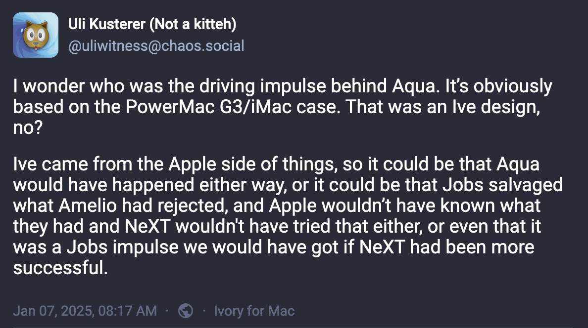
And Uli here is wondering about what motivated this huge leap:

Did hardware drive software or vice-versa, or both?
The Aqua Era, as Open Source Project
The professor / developer Jon Sterling recently launched a GitHub project called AquaUI that allows developers to build Mac apps with a reasonable approximation of the Aqua look-and-feel.
Conclusion
Aqua and its hardware contemporaries were the last sentinel moments of a computing culture that was fairly uniform: there were clone PCs with windows and then there were the fun and artsy Macs. The fun and artsy aesthetic of Aqua/Apple promised exploration, delight, and pizzazz. In time, Apple dropped Aqua’s influence on its premiere hardware platform, the iPhone, and embraced flat design. Suddenly the arty, Apple-y feel was gone. And on their neutral, industrial, flat platform, the apps took center stage. Misinformation, self-harm content, mindless mental junk food of 15 second videos: they all are making our hearts sad and instead of saying that we’re saying, “I miss Aqua.”