AI's Impact on the UX of Code Editors
- 13 minutes read - 2727 wordsI’ve written a lot about editors here over the years (editors, vim). But I’m starting to sense something interesting. For programmers who have adopted AI and agentic workflows, the IDE may be hindering productivity.
And even for those who, like myself, prefer a minimalist experience
(tmux/zellij + editor), I think we might need to update our workflows as
well.
Lately I’ve been replacing VSCode and tmux+vim with a window and pane
configuration that prioritizes the Claude Code session over the editor. I’ve also
been using my phone + claude --remote more. Let me share some of my new
workflow.
AI Changes the Input Side
AI tooling introduces a new participant in the development loop. The editor is no longer just receiving intent; it’s proposing it.
AI Suggestions Can Be Annoying Or Effortless
When Copilot started completing my function bodies in 2025, the first thing I noticed wasn’t productivity; it was the strange knee-jerk of “shut up and go away.” It wasn’t like Intellisense completing what I knew but needed help with. It was trying to put me in the back seat (like no real co-pilot ought to do).
Claude Code flipped the script by saying: let’s have a chat about the code I can generate and then you leave me to do the generation. This has been effective. However, it shifts developer burden to review, evaluation, and judicious committing.
Editor Review Tools Are Poor
The editor now has to support review as a first-class interaction, not just composition. Let’s be specific and define review as the process of:
- Evaluating the best possible change to evolve the state of the program
- Easily reverting ineffective or distracting changes
- Committing germane changes with valuable metadata
However at best, these feel cobbled together in VS Code. I don’t know anyone
who is effective at the git explorer in the tool.
Terminal users are functioning about the same as they were: git diff at the
command line and maybe a diff-savvy visualizer. git add --patch and git checkout --patch allow piecemeal reversions.
And the problems with the IDE as a review platform point out that it’s a really inelegant tool. If we dig deeper into its design we start to see that its opinionless shape and extreme flexibility make it great at very little.
The IDE Design Standard: Dull, Old, Ubiquitous
An IDE is just a few ingredients:
- A text buffer with syntax highlighting
- n-many micro windows (panels) to the left, bottom, or right of the text window
- n-many functions embedded in the panels
The formula calcified early. By the time I was writing Java in Eclipse (2001), the dominant metaphor was already fixed: left panel for files, center for code, right panel for something (package exploration; docs), bottom bar for system (“Task”) output. This was presented as the natural shape of a programming environment.
VSCode was more minimalistic (perhaps in the spirit of Textmate, Atom, or Sublime?) when I first encountered it 8 years ago:
- Left panel: “Explorers” (File browser, Version Control browser, Extension browser)
- Bottom panel: Tasks + Terminal (OS integration)
But since Microsoft made its bet on GitHub and OpenAI, it’s restored the right panel to be the place where AI chats via the “Copilot” plugin reside. Thus:
- Left panel: “Explorers” (File browser, Version Control browser, Extension browser)
- Right panel (resurrected in the AI age): “AI chat”
- Bottom panel: Tasks + Terminal (OS integration)
- Whatever’s left: Editor area (with multiple tabs or a vertical split)
But in this darkness there is light. Sometimes someone makes something so bad that it becomes easier to see what the problem is.
The VS Code Nightmare
The VS Code design, such as it is, is aggravating and confusing because it’s a relic of the pre-AI-Enabled coding. It, and to be fair other tools, are still mistakenly centering editing over prompting. And because they are confused, their usage is complex, finicky, and inefficient.
You came here to prompt an AI and review code. Instead you’re a window manager.
Before you’ve opened a single file, VS Code has already divided the territory:
No code open. No problem. The AI panel has already claimed its third of the screen, just in case you forget it’s there.
Open a file, start working, bring the AI into the conversation and now all three panels assert themselves simultaneously. The code editor, nominally the point of the whole exercise, gets squeezed into the center:
File explorer on the left, AI chat on the right, your code in the middle wondering what it did wrong.
Now the AI has written something worth reading. A long response. You need to actually read it. So you expand the chat panel—and the code disappears:
Maximized the AI panel to read the response. Somewhere behind it, your code is fine, probably.
OK, you’ve read it. You want to review the changes. Collapse the chat panel. Now the AI is gone:
Collapsed the AI panel to see the code. Repeat this step approximately forever.
This is the loop. Expand, read, collapse, review, expand again. Every cycle costs a click and a reorientation. The interface isn’t helping you think; it’s making you administer it.
And when the AI does offer an inline suggestion, the affordance for accepting it is visually disorienting by smearing indistinguishable cues all over your actual editing area (when you’re actually in a reviewing register).
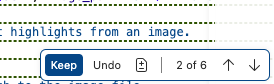
The most important decision in your workflow: accept or reject the AI’s work. Hope you brought your reading glasses.
If you find yourself wondering how many ways VS Code offers to manage this mess, the View menu will be happy to show you:
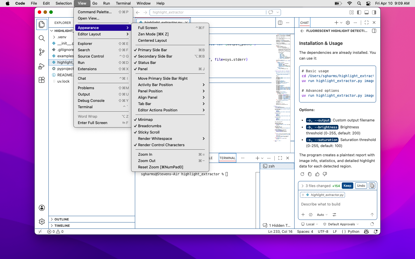
A dedicated submenu for deciding what you’re allowed to see. Most of these don’t have keyboard hotkeys and, need I point out, these eclipse the code, too!
Working in a console-based development environment, I’ve gotten used to more
ergonomic, home-row-based editing strategies. And prefix-z — zoom any
pane full-screen in an instant — is a mechanic VSCode should just steal.
Toggle in for focus on any task (editing, reviewing, committing) and then flop
back out to a full context view in a keypress. It’s definitely more comfortable
(and necessitates no mouse).
Same Problem, Better Keybindings
If your reaction to the VS Code section was well obviously it sucks, that’s
why I use tmux or zellij — I have news.
The 70/30 split: Claude on the top, the ex editor below.
My tmux setup is robust and has been reliable in multiple languages at
multiple employers with very little adjustment.

The window list: each window has one primary job. Occasionally an ephemeral panel might pop up e.g. a split in the hugo window to run the hugo command versus the server.
- Window 1: The running environment (local server running the application)
- Window 2:
vim+ tabs +ctags/LSP for navigation - Window 3:
gitreview zone; 1-off shell commands - Window High: REPL or CLI to the application
- Window High - 1: Additional shell or DB REPL
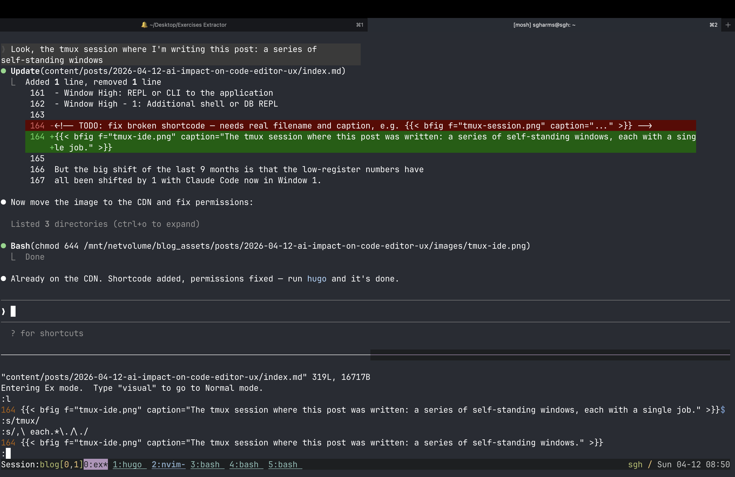
The tmux session where this post was written: a series of self-standing windows, each with a single job.
But the big shift of the last 9 months is that the low-register numbers have all been shifted by 1 with Claude Code now in Window 1.
And yet.
Reviewing remains an unassisted activity and editing + Claude use remain unintegrated.
Last winter, I started keeping Claude and vim together in a split within
window 1. One pane for the session, one for the editor. And here’s what that
split actually looks like: not 50/50. Not even close. It’s more like 70%
Claude, 30% vim. I resized it once and never moved it back.
That 30% pane tells the story. The editor’s not there for editing — not in
the sense I’ve spent my career understanding that word. It’s there for
reviewing. But that kind of review is too narrow: it doesn’t cover the full
change set that git tracks, and I’m barely inputting anyway. What’s the
editor for, now?
Back to the Future: The ex Experiment, an Editor for Reviewing
ex is the editor underneath vi, which is the editor underneath vim. Bill Joy wrote it at Berkeley in 1976. When you type a : command in vim — :w, :s/foo/bar/, :47d — you are using ex. It has been there the whole time, load-bearing and invisible.
ex and its predecessor ed were designed for the teletype. This turns out to
be a gift because those were review-heavy interfaces. One’s time “on” the
computer was brief so reading listings and preparing input – slower,
thoughtful modalities were baked into these early editors. Kay Lack has done a
beautiful reflection on thinking like ed on her YouTube channel.
Under the influence of Kay’s work and my general interest in retrocomputing, I
put ex as my “editor” in the 30% panel paired with Claude Code. So, ex can
function as a lightweight editor, but how does Claude Code function as a
teletype?
Claude Code, when it works through a file, references line numbers constantly. “Line 47: change the threshold argument.” “Lines 82–89: extract this into a function.” Its output is a running, annotated account of the file — exactly the kind of external state a teletype user depended on the paper to provide. Claude is the paper.
Which means: with Claude in one pane and ex in the other, I can edit code the
way programmers did in 1970. I read Claude’s output. I issue a line-oriented
command. 47c to change line 47. 82,89d to delete a range. :s/old/new/ to
substitute. I don’t need to navigate to the line with hjkl, scroll to find
it, or keep the file mentally indexed. Claude told me where to go. ex gets me
there in one command.
The surprising part — the part that still catches me off guard — is that this
works. Not as a curiosity or a stunt. As a workflow. Line-oriented editing,
guided by an AI’s annotated output, turns out to be entirely adequate for the
class of edits that remain after Claude has done the heavy lifting. The edits
that are left are small and precise: a word changed here, a line removed there,
a quick structural nudge. ex handles all of them without ceremony.
I’ll be honest, I’m still clunky with this, but I’ve been surprised. I’ve
included my ex cheatsheet as bonus material.
The Editor Didn’t Die. It Got a Smaller Office.
If you think a lot about editors — too much, really — you come to the conclusion that the editor was never the point. It was the best available interface for expressing human intent to a computer. You had an idea; the editor was how you got it into the file system. All the power features — fuzzy finding, LSP, split panes, plugin ecosystems — were optimizations on that one job.
That job has been partially reassigned.
Not fully. There are still moments that belong entirely to me: the design decision that requires holding the whole system in my head, the subtle rename that only makes sense if you understand the six-month history, the quick fix I can see and execute faster than I could describe it.
But those moments are a smaller fraction of my day than they were two years ago. And the fraction is shrinking.
And yeah, sometimes it’s just easier to do an edit (and ex is fabulous here).
What’s taken editors’ place isn’t a better editor. It’s a conversation. I
describe intent in thoughtful English; I review, redirect, and occasionally
reach for ex to make the one-line correction Claude flagged. The editor has
become a finishing tool — the fine brush you pick up after the broad strokes
are already on the canvas.
The interfaces we’ve spent cough decades perfecting were all optimized for a
workflow that’s already changed beneath us. VSCode adding an AI panel didn’t
reimagine the interface; it just frankenwelded on a new panel yet again.
tmux’s lightweight nature makes it seem less clunky, but, for these purposes,
adding a new window that can be accessed ergonomically is a tomato/tomahto
distinction. Neither questioned the underlying model.
The ex experiment suggests something stranger: that the right shape might be
much simpler, more historic, than we assumed. A line editor from 1976, an AI
dev tool from 2024, and a pane split that increasingly showcases the model:
that’s not a regression; that’s the workflow finding its new, actual center of
gravity.
Oh, and by the way, and harder to show, I’ve been asking the Claude agent to do housekeeping chores like image insertion, rebuild, cross-post link finding and embedding by voice. If these interfaces were creaking under the fingers-and-keyboard model, they’re stunned in silence as we roll voice (gesture, sketch?) into the mix.
BONUS: ex Cheatsheet
Spoiler
ex ships on every UNIX and Linux system and opens any file from the command line. To jump straight to a line, pass it with +:
ex +47 CLAUDE.md
Once inside, the prompt is :. The commands you’ll reach for most:
| Command | What it does |
|---|---|
p |
Print the current line (useful to orient yourself) |
i |
Insert lines before the current line; end with . on its own line |
a |
Append lines after the current line; end with . |
c |
Change the current line, replacing it; end with . |
d |
Delete the current line |
You can prefix any command with a line number: 12p prints line 12, 5,9d deletes lines 5 through 9.
To see a few lines of context around your current position, use the z command with a count:
z7
That displays 7 lines centered on the current line: three above, the current line, three below. To make this happen automatically whenever you land on a line after opening a file, put the following in ~/.exrc:
set window=7
window controls how many lines ex shows during scroll and display operations. With it set, arriving at your target line via ex +47 file and then typing z gives you the ±3 context without any extra typing.
BONUS: But What About Your File Explorer?
A common objection I hear from people still anchored to the old model goes something like: but how do you know what’s in the codebase? How do you navigate it?
This is staring at the finger instead of the moon.
The file explorer (that left-hand drawer full of collapsible tree nodes) was never really about the files. It was a workaround for the poverty of every other tool we had for understanding code structure and semantic intention. ctags was a hack to answer “where is this symbol defined?” The directory tree was a hack to answer “what does this project contain and how is it organized?” These were load-bearing scaffolds for a world where the human had to navigate the codebase manually, file by file, because nothing else could.
LSP largely retired ctags. It gave us go-to-definition, find-references, and symbol search that actually understood the language semantics rather than pattern-matching on text. The file tree became less essential the moment you could ask “show me all callers of this function” and get a correct answer.
AI agents retire the file tree for the same reason, and then some. When Claude Code is reading your codebase, it isn’t browsing a sidebar. It’s reading what’s relevant to the task. The hierarchical organization of files on disk (a computer science artifact, the concrete realization of an abstract tree) was meaningful when you were the one navigating it. It was the index because you were the one doing the lookup.
If you’re not doing the lookup anymore, you don’t need the index. The directory structure was always a concession to human memory limitations and tooling inadequacy, not a fundamental truth about how software should be organized. Holding on to it as the primary interface for understanding a codebase is like insisting on a card catalog after the library got a search engine.
Let it go.
BONUS: What I’d Like to See
A few things I think would meaningfully improve AI-augmented editor UX:
- Better uncertainty signaling. Show me when the model is extrapolating versus pattern-matching. Even a simple confidence gradient on ghost text would help.
- Cleaner agentic review UI. When an agent makes multiple changes across files, the diff-per-file view in most tools is harder to reason about than a unified narrative of what changed and why. I want the agent to explain its reasoning alongside the code.