My New Linux
- 7 minutes read - 1382 wordsRecently I’ve been feeling the urge to touch a Linux laptop again, and I thought I’d see where we were in terms of progress toward an easy-to-install and easy-to-use experience.
Ultimately, I tried 3 distributions:
and stopped on the Ubuntu Mate. Let me tell you why.

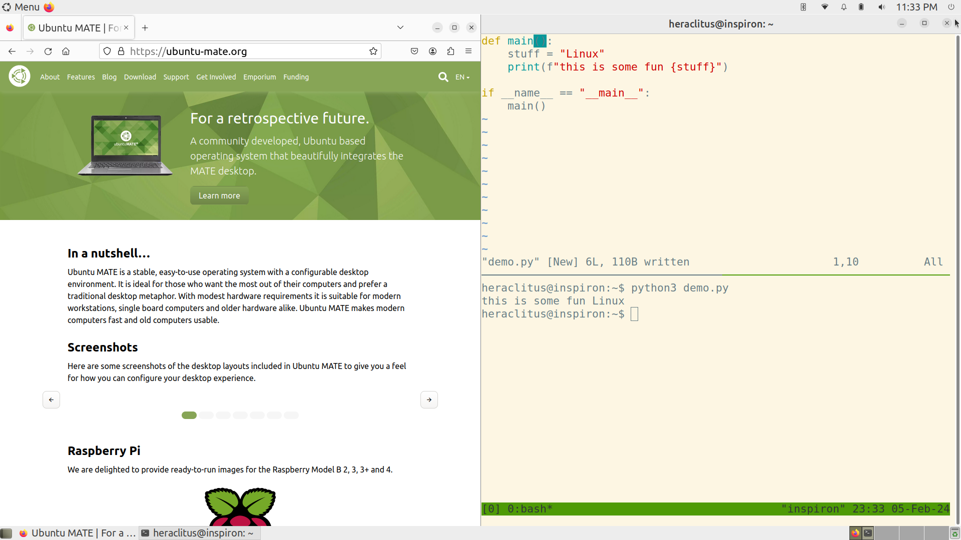
End result
Goals
Frugal With Resources
First, my hardware is an old Dell Inspiron that I got from my local repair shop
in 2016. I keep it as an emergency Windows machine (used it to generate GPG
keys under authoritarian presidents). The main work that I’m going to be doing
on this machine is clisp, vim, git and maybe some blogging with hugo
and golang. My horsepower needs will be fairly meager. Also, owing to the
Windows installation, I only had about 20GB for an installation target. This
operating system was going to have to be curated to a minimal footprint.
So that means I need a small-footprint, old-hardware friendly distribution. The distributions I mentioned above are designed to just such criteria. But this throws out richer, more graphics/image/multimedia distributions that are designed to compete with Windows or Mac full. By way of comparison, Linux Mint (not to be confused with Mate!) needs something on the order of 100GB.
Easy
Something that I learned over the years (since…1999?) curating Linux installations is that I am tired of fixing broken ones. I’m not going to fall prey to the sunk cost fallacy while trying to recover a distribution by proving to myself that I can pull a distribution out of a tailspin. At the first sign of trouble, I’m going to cut, image a new USB key and move on. This is one of the understated joys of Linux: if you find a distribution throws up too many errors in your path, you can just go to a different distribution. My last mega-install-fest was around 2001 when I got a disc from just about every major distribution while at LinuxConf San Jose. There are now at least thrice (50-100?) distributions afoot in the world today. If someone’s attitude, documentation, design, or constraints don’t align, move on.
Minimalist
As I wrote, the goal of this computer is to be a programming computer. Too often when i reach my home laptop at the end of the day to do some hacking, my email reminds me of bills our interesting tabs or obligations. It moves me away from writing this blog, writing to my son, or writing code. I need a dedicated place to just get coding. Consequently, I only need a nice terminal for programming, a browser, and a PDF reader.
OK, so all three of these candidates met the frugal with resources level. I like using Ubuntu on my servers, so I thought “why not go with their small-footprint” solution, Lubuntu?
Lubuntu
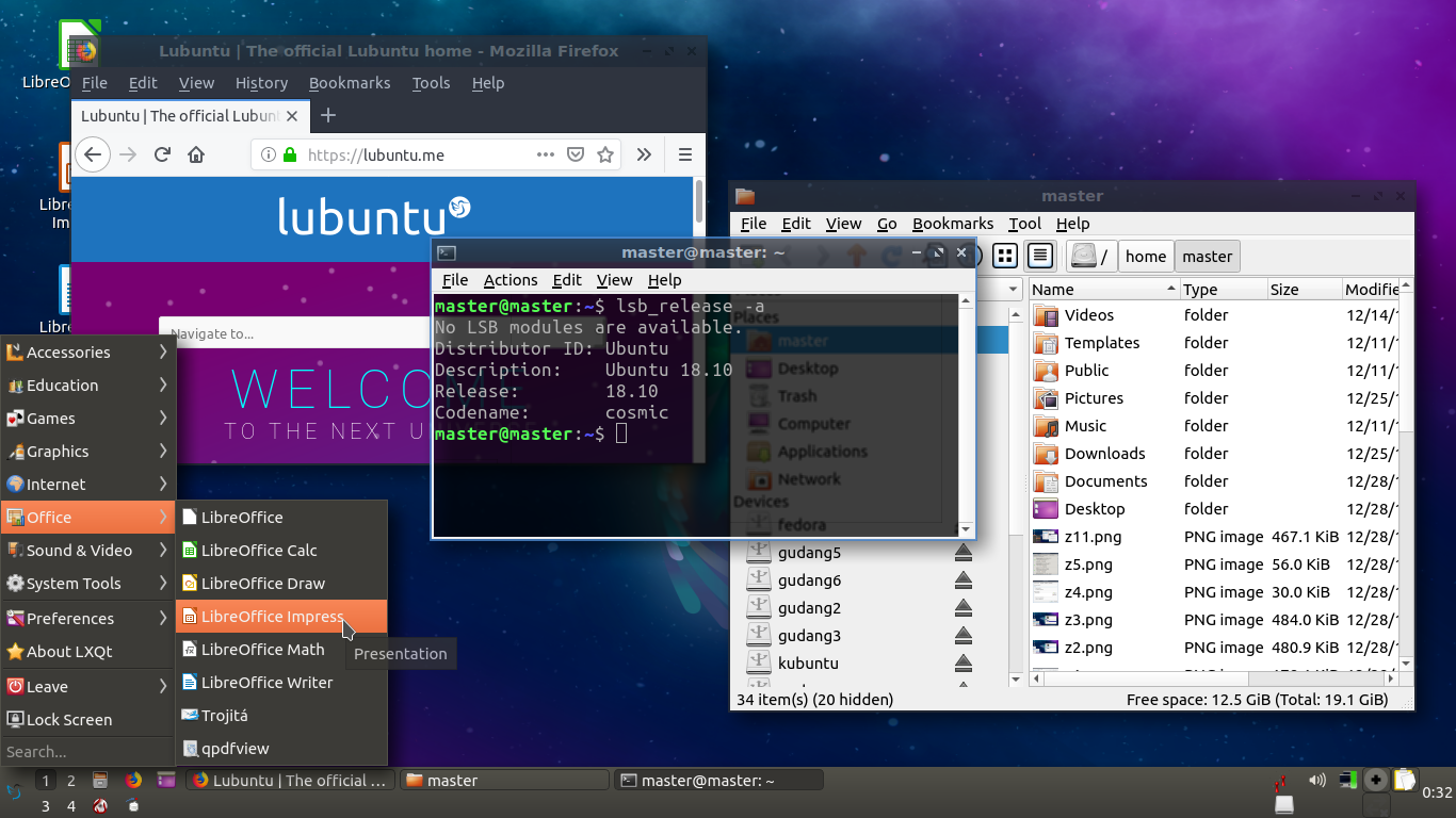
Lubuntu’s great it’s great, just great. But…
As I used its LOVELY desktop it really started to rankle me that it has such a Qt-Toolkit look and feel. And that’s a pejorative observation. Back in the early 2000’s, I preferred the Gnome desktop because I hated the pre-school poster look and feel of the toolkit’s images and icons. I know, it’s cute and friendly. I know, it makes Windows users feel like they’ve not completely jumped into a hell where user experience went to die.
I tried living with it for about 48 hours, but every time I opened up the desktop, I felt imprisoned by USER FRIENDLY APPROACHABILITY fascism.

Hey Ren, when you use this Linux, I don’t think you’re happy enough
Look at the amount of chrome above the terminal area. Look at the well-drawn and friendly row of icons in the lower right that say “Hey, we’re here to make computing on free software fun.” After 2 days, I was looking for ways to change the window manager to something else. First, that’s a violation of “Easy.” It’s also a violation of “Minimalist.” It was time to move on.
Bodhi Linux
One of my favorite experiences during my last install-fest, nearly 20 years ago was installing Slackware Linux which, at that time, was shipping with the Enlightenment window manager.

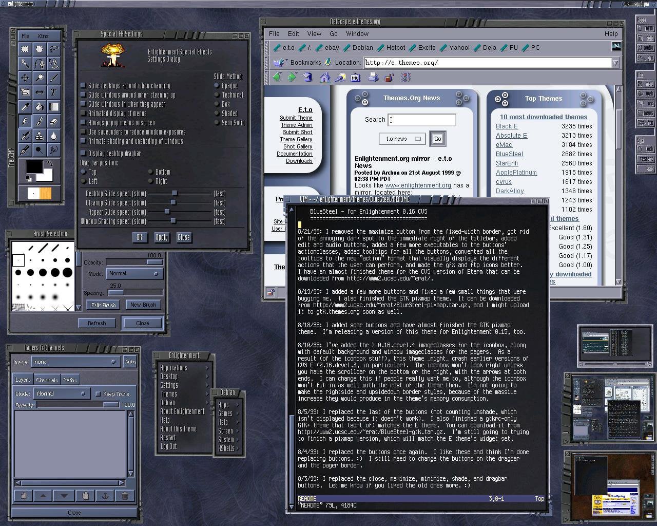
Pushing the boundaries of what UX can look like
It had a ton of beautiful eye candy features that Windows and Mac are just now integrating. Look at the “mini” version of the virtual desktops in the lower right corner. You could have multiple desktops and see what’s going on in them in realtime? Astounding.
So when I saw that there was a light distribution that uses a modern Enlightenment, I was charmed. Maybe in the intervening decades configuring and working with Enlightenment got easier?
Out of the box, Bodhi was beautiful and was a definite step away from the kinderstil of Lubuntu.

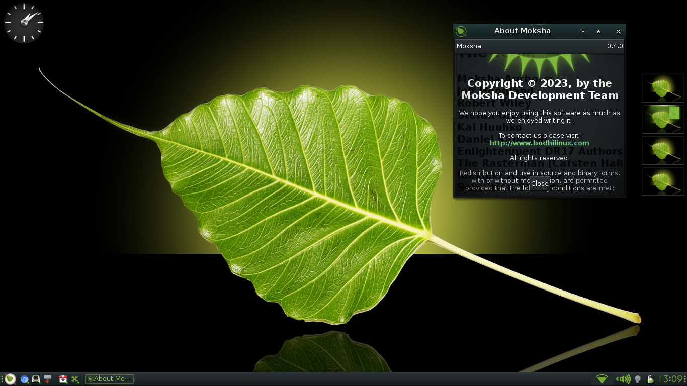
Clean, minimal, and green
But as I started working with it and using its very pretty and very glossy terminal application, Terminology, I had a problem. This very cool, very sleek, very minimal font size was too damn small for my eyes!
Linux is, by in large, a young person’s game with Minority Report-inspired aesthetics and features like “semi-transparent terminal backgrounds.” On top of this, I was working on this during a sunny part of the day. On a glassy, glossy, fingerprint-smudged screen (thanks touch interface!) it was really hard for me to read. I was, yet again, starting to feel “Easy” falling apart.
I looked for obvious places to make bigger fonts the default in both menus as well as in Terminology. I basically found a support ticket where the response was “Use zoom feature, not really a thing we’re into” for terminology. I (eventually) did find out where to change the scaling factor on system menus, but, jeez. This is not easy. I just want to be able to see the screen and my code in it.
I started writing a new USB key for a new distribution.
Ubuntu Mate
As I looked around for smaller distro catalogs and saw a stray mention of Ubuntu Mate. So I checked out their main page and read this:
Ubuntu MATE is a stable, easy-to-use operating system with a configurable desktop environment. It is ideal for those who want the most out of their computers and prefer a traditional desktop metaphor. With modest hardware requirements it is suitable for modern workstations, single board computers and older hardware alike. Ubuntu MATE makes modern computers fast and old computers usable.
OK, so that’s definitely aligned to my needs. Ubuntu Mate had a lot of the same kind of green and friendly vibe of Bodhi, but the interface seemed a bit less edgy for its own sake. It was also using a more conventional desktop program. It was also a bit bigger than Lubuntu, but not quite as full as Ubuntu. I burned it to USB key and installed.
Ubuntu Mate is minimal, it’s green, it’s friendly.
Since I know Ubuntu well, I know that getting software is a snap with apt.
With a few simple calls to apt I had vim, git, and clisp installed.
I popped open the terminal client and found that it came shipped with the high-contrast Solarized light theme. Done and Done. While there, I changed my terminal fonts to be big.
I then went to the system preferences and made the window title bar and system menus text big. I swapped caps lock for control key. I accelerated the hell out of my trackpad and changed to “natural scrolling.” I noticed that Mate ships with “Magnus” a built-in software magnifier for if things get too, too tiny. Thanks!
Easy.
While checking out the menus, I found global keyboard hotkeys and added ones to launch terminal windows and browsers. With a little research, I had key combinations for maximizing, minimizing, pushing a window to left-half or right-half quickly (the same keystrokes as those in Windows 10-11). I then added hotkeys for moving between the virtual desktops.
On top of it, their welcome center just exuded openness and availability. I turned it off forever (easy, just a checkbox), but I appreciated that they were there.
I did some light coding and things were easy to read/run/compile. I tossed the USB key in a drawer. This is the kind of Linux world I want to be in.